PROJECT ROLE
Brand Identity Design
CREDITS
Brand identity: Adam Fairhurst
Web design and dev: Breakout Digital
YEAR
2025
Overview
AGR Facilities Management was a new company beginning to secure large-scale commercial contracts but had no professional brand identity. I was brought in to create their first identity system – one that would feel trustworthy, scalable, and appeal to commercial clients. The final direction was signed off with no changes, and the client reported feeling confident using it across print and digital.
Role & Responsibilities
- Ran discovery session to define scope and client goals
- Researched visual trends in facilities and property management
- Created mood boards and presented industry insights
- Developed and presented two distinct brand concepts
- Delivered full identity system for use across print and digital
AGR was starting to target larger corporate clients, but they did not have a brand identity to do this under.
AGR was beginning to work with large clients, but lacked a visual identity that reflected their level of professionalism. The brief called for a clean, modern brand system that could be used across uniforms, van graphics, leaflets and a new website – while helping them appear credible and trustworthy to commercial clients.
Collaborating with the client, I set the project goals:
- Design a professional identity that appeals to large, commerical clients
- Work across physical and digital touchpoints
- Ensure the client felt confident using the brand from day one
I went off and researched the industry, competitors, and created two mood boards with distinct styles the identity could go down.
To kick things off, I held a discovery call with the client to better understand his needs and direction. I then conducted competitor research and created a readout showing how competitors use visual design.
Key patterns across the sector:
- Blue or green used to signal trust, growth, or eco-awareness
- Abstract logomarks, some referencing buildings or property
- Modern sans-serif typography for clarity and professionalism
I presented two moodboards showing different stylistic approaches based on these findings, which helped guide the design phase.


After signing off the visual style, I developed two identities:
With a clear direction, I developed two concept routes:
Concept 1:
An abstract building shape formed from negative space, paired with a custom logotype inspired by a reference the client responded well to during moodboarding.
Concept 2:
A modular logomark again inspired by architectural form, but with a geometric grid-based logotype. Each letter (A, G, R) was built from equal squares, creating a more technical, structured look.


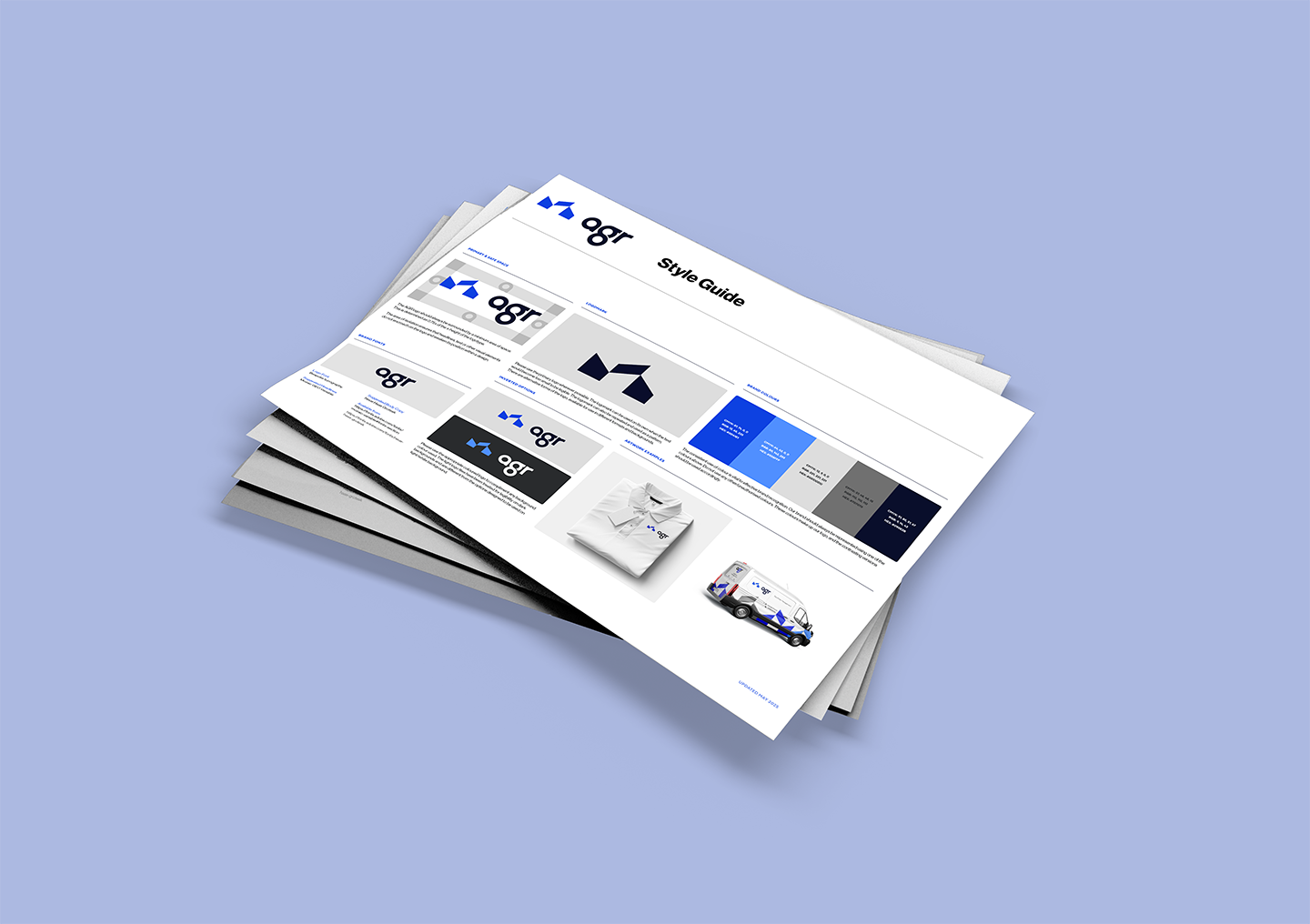
Final Identity Design
The client selected Concept 1 with no changes. The final identity included:
- Custom logotype and scalable logomark
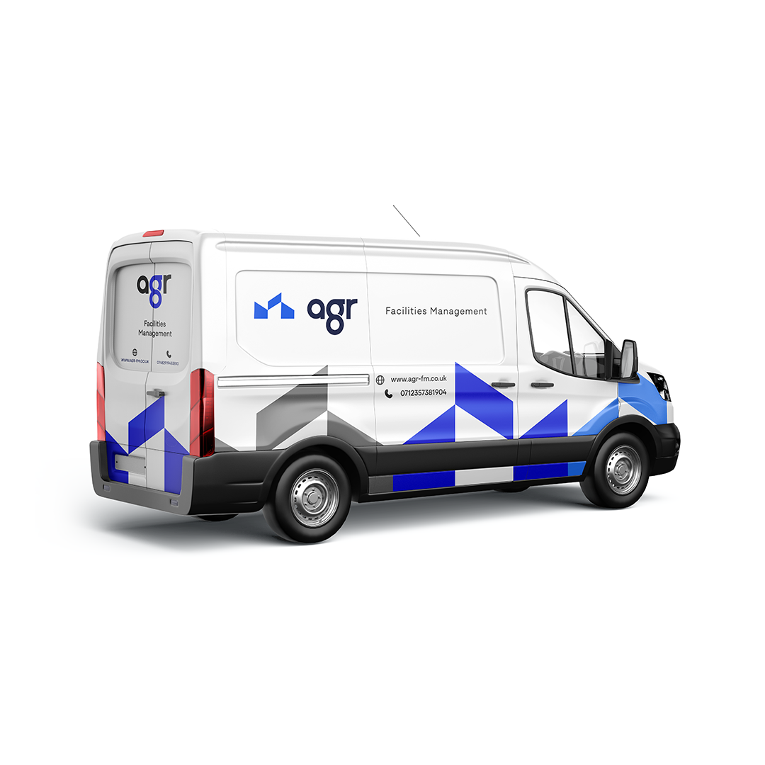
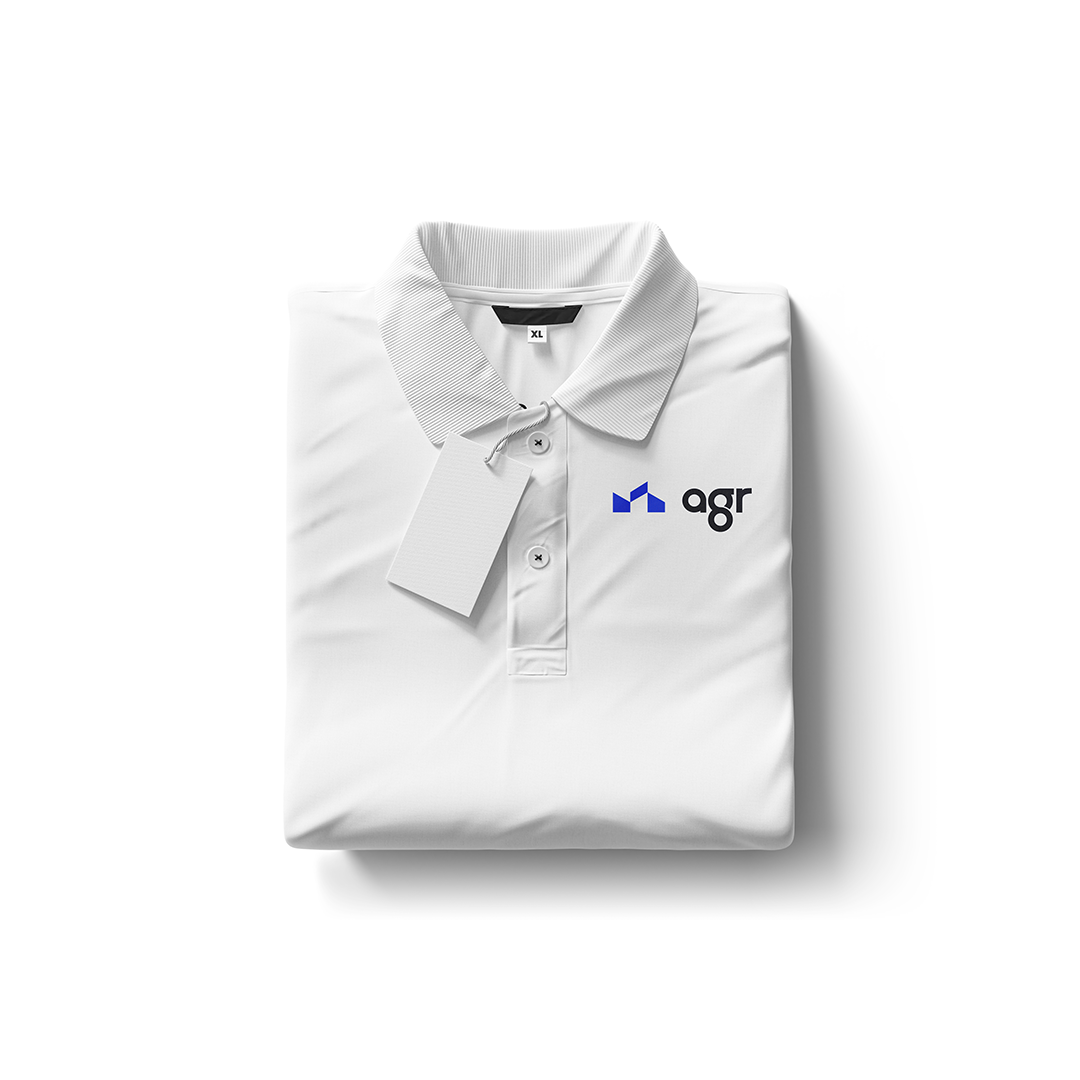
- Flexible system for use across uniforms, print, and digital
- Colour palette with strong, clean contrast
- Clear usage guidelines for third parties
Results
- The client felt the identity reflected the high level of service and professionalism they offer to their clients
- Brand has since been applied across web, uniforms, vehicle graphics and printed materials
- Helped establish credibility with new clients during early growth phase
Reflection
This project showed how valuable early research and mood boarding can be in aligning with the client’s expectations. Presenting grounded options helped build trust, and resulted in fast approval.
Bring your project to life
Book a free discovery call with me to get your new brand identity up and running.